
Carevo
Carevo is a tablet app + device system that helps nurses communicate directly with patients from differing language backgrounds.
Role(solo): Research, UI & UX Design
Programs/Websites Used: Figma, Adobe Illustrator, Miro

The idea for this design is one that I had been thinking about for a pretty long time. My mom is a nurse and has been one for my entire life. I have grown up listening to her talk about the ups and downs of her job. When I began pursuing UX, I started looking at the frustrations she had with her job in a new light. I quickly realized that many of the challenges she faces could be solved if someone sat down and actually applied strong UX design thinking to the issues that nurses face on a daily basis. One challenge I have heard my mom talk about for as long as I can remember is the frustration that comes with trying to communicate with patients who cannot speak English and the lack of reliable resources to aid the translation process.
TARGET USERS
Nurses:
need to accurately relay important medical information to patients
family members who translate don’t always properly convey what the patient is saying
don’t have time to wait for a hospital translator to arrive
Patients:
cant communicate with nurses about pain, meds, and procedures
family members don’t accurately translate what they are saying
scared and/or discouraged to ask questions due to language barrier
PROBLEM: Nurses are struggling to converse with patients from differing language backgrounds which leads to misconstrued medical information, confused patients, and frustrated nurses.
GOAL: Close the language gap between nurses and patients in order to better facilitate important medical conversations.
DISCOVER PHASE
I surveyed 12 nurses who worked in critical patient care areas of hospitals to collect information about nurses experiences with non-english speaking patients and the current resources available to help them communicate with those patients.
MAIN THEMES FROM RESEARCH
nurses dont have a lot of spare time
hospital translation services are a pain to use and have at least a 5 minute wait time
nurses care most about medications, allergies, and patient history
nurses typically have around 7 non-english speaking patients a month
Through talking to nurses, I was able to begin to picture what this app should look like and more importantly, how it should function.
DEFINE PHASE
During this phase, my goal was to identify the main features and flow of my app.
Based on my research insights I knew that my users needed:
a straightforward, one-touch experience where typing isn’t necessary
the ability to add relevant information to a patient’s chart instead of having to re-enter it at a later time
a device that can act as a powerful listening and speaking tool for the patient to ensure that there is no risk of mistranslation of critical medical information
I started by creating a journey map that outlined the process a nurse would go through to initiate a conversation with a non-english speaking patient.

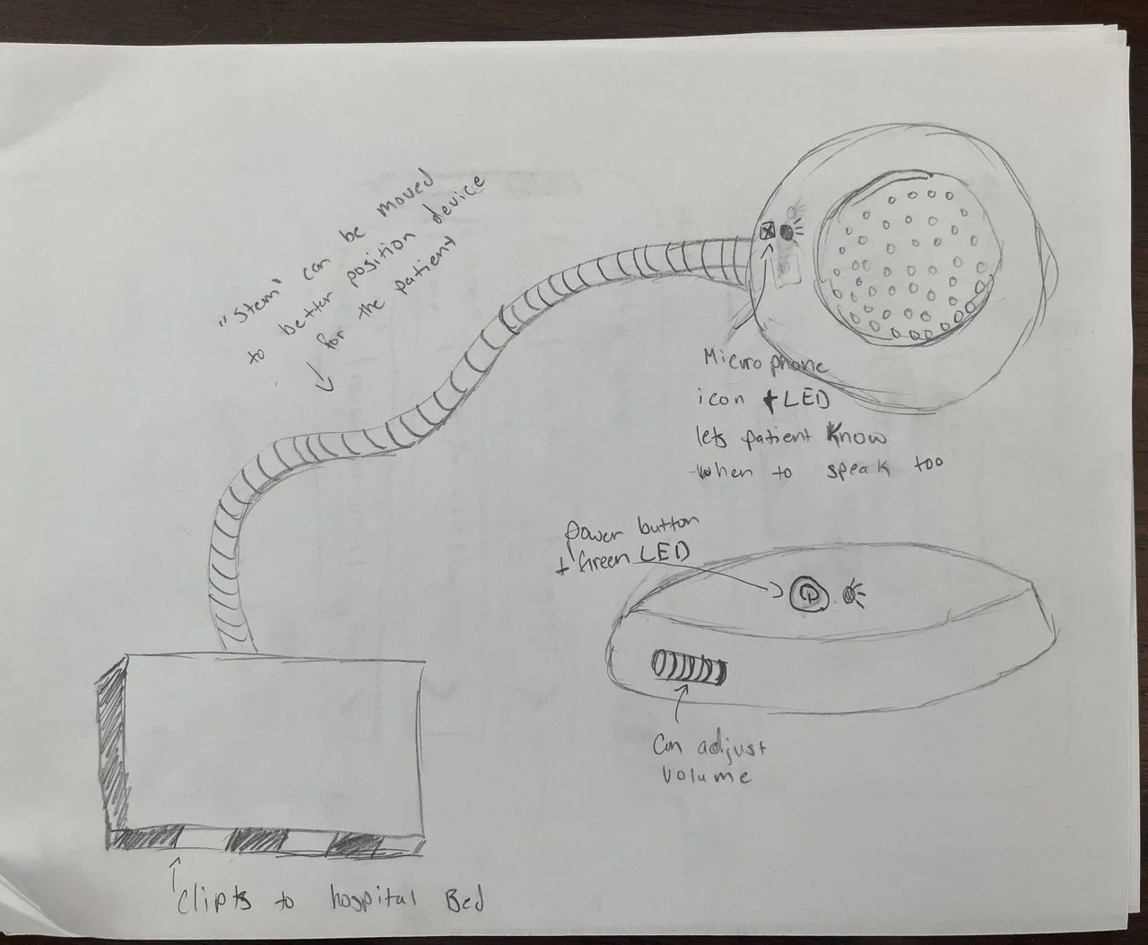
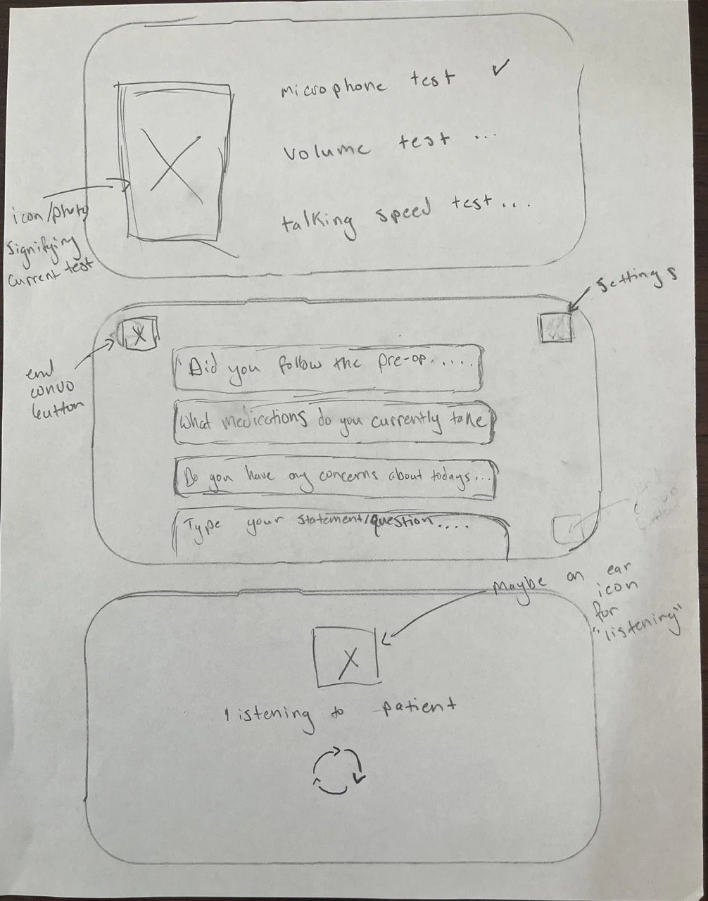
I then created sketches of potential screens. I also made one for the accompanying device. Though I wasn’t planning on creating a finished concept design of the device, I still wanted to make sure to have a good idea of how it might work and interact with the app.
I decided that the device would be one that a nurse could clip onto a hospital bed and easily manipulate with a bendy ‘neck’. The process of connecting to the device would be done with nurses step by step, and they would be given the opportunity to check with the patient if the volume and talking speed were right.
Finally, I began working on wireframing the app, making sure to back my design decisions up with psychological and gestalt principles like Fitt’s & Tesler’s laws, and the rules of scarcity and peak end. It is important to me that there is concrete evidence to back up what the user is looking at. Many modern designs I see people create are beautiful but from a functionality standpoint, they are way too complex and violate basic ux principles. When you have a working user like a nurse who is trying to juggle a lot of different tasks, a design that guides them through a process and offers few choices wins out over one that may appear more robust with all the ‘bells and whistles’.


DESIGN PHASE
Finally, it was time to sit down and create a working, full-color prototype. I decided to go with a bright and inviting look that was scannable and easy to process. Nurses can feel in control of the entire translation process as the app always informs them of what ‘step’ of translation they are currently on. Additionally, AI is utilized to help nurses quickly identify the most important information a patient is saying, such as medication doses or pre-existing conditions, with the ‘Highlight Insights’ feature. They can also easily add relevant medical information right to a patient’s chart with the touch of a button.
NEXT STEPS AND FUTURE ITERATIONS
This project allowed me to explore an idea I had been thinking about for a while and while I am generally happy with the results, there is still work to be done and I have a few ideas I would like to further explore in future iterations.
Next Steps:
Usability Testing
To make impactful improvements to my design, I want to conduct usability testing with actual nurses. This will allow me to hear from real potential users about what my design is doing right and wrong.
Future Iterations
Further refine the device pairing process.
This is likely the most “complex” process users need to complete in the carevo app, and I feel like refining the pairing instructions to be a bit more detailed and explicit would result in fewer user errors and eliminate confusion before the the real purpose of the app has even been explored.
Implement more AI assistance functionality.
Carevo utilizes AI to help nurses filter out the most relevant patient information by highlighting the info and offering to add it to a patient chart via a checkbox. In the future, I would love to further define exactly how this function would work. Should nurses be able to edit/remove some of the highlighted info? How would nurses interact with this tool on a touchscreen?