NATIONAL PARKS
DATA VISUALIZATION
A data visualization and interactive dashboard that provides audiences with an overview of the 64 U.S. national parks.
Programs/Websites Used: Kaggle, Google Sheets, RStudio, QGIS, Adobe Illustrator, Tableau
DISCOVER PHASE

As a Colorado native, I have spent my fair share of time outside enjoying the natural beauty of the mountains and the great plains. I spent a large chunk of my childhood taking family road trips to national parks in the southwest and rocky mountain region of the U.S. When tasked with creating a data visualization for one of my masters classes, I quickly decided I wanted to do something on the national parks.
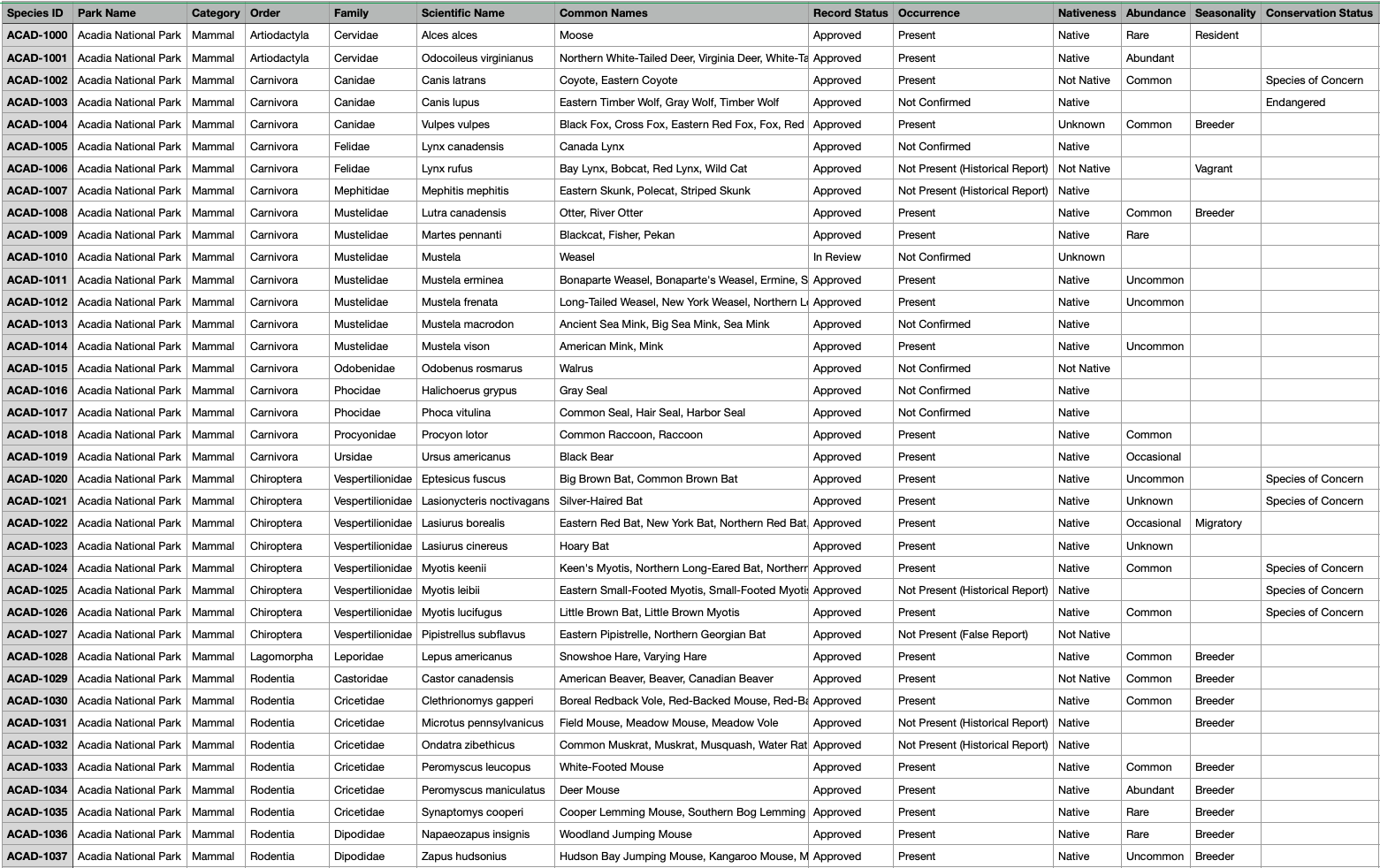
Before any sort of design work could begin, I needed to find data. Without good data, a visualization can be hard to put together and tough for audiences to interpret. I wanted to highlight park visitation, land area, and the wildlife of parks, so I searched map files, visitor logs, wildlife research, and various park websites. I selected data from three primary sources: a kaggle dataset with park species information, a responsible dataset posting with NPS provided park visitation data, and a geodata map with park location shapefiles.
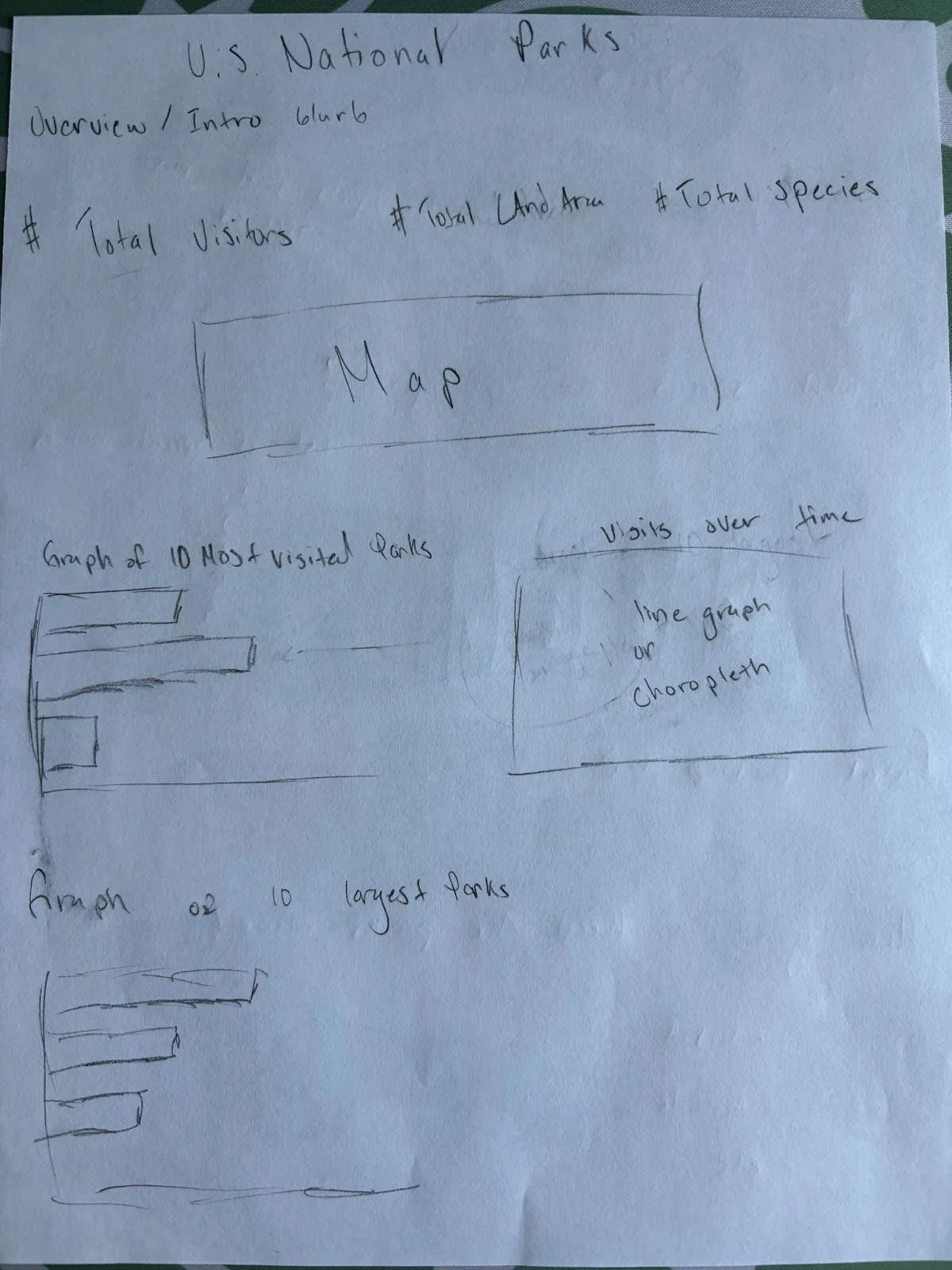
Next, I created a basic sketch of what I had in mind for my visualization. This would help me identify what formats the data needed to be in and if any extra calculations were necessary to create the graphs I had in mind.
DESIGN PHASE
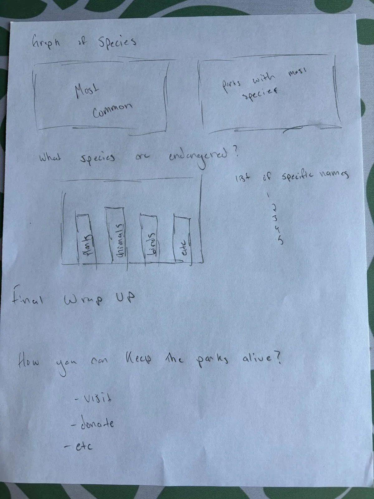
Based on my sketches, I created a list of all the graphs I wanted to make and the information each one needed to be generated.
Maps:
Visualize the location of all national park land in the United States
Visualize the different national park regions
Bar Graphs:
Display the top ten largest national parks by acreage
Display the top ten most visited parks by total park visitors in 2023
Display the top ten most biodiverse parks by number of species and species category
Tree Maps:
Visualize the distribution of land area that each national park takes up
Line Graphs:
Visualize the change in park visitation by year between 1990 and 2023
I used RStudio to clean/organize the data and then generate the necessary graphs. GQIS was used to create a map of the parks with the different regions colored accordingly. The generated maps and graphs required significant work to make presentable, so this is where the design phase really began.


The composition was created using Adobe Illustrator. I used the official national parks font for all text and selected colors that are commonly used in their branding and print materials. My main goal was to present information in a structured and easy-to-understand manner. I also wanted to take the audience on a journey, just like the ones park visitors take.
Readers are presented with an overview of U.S. national parks with a map to establish context before diving into more specific information on each category of data. Throughout the visualization, larger quantities are represented by taller graphs or larger blocks. Drastic changes in data are represented by steeper lines, whereas small changes are represented by flatter lines. I also color-coded coded necessary data so differences could be easily perceived.
In addition to creating a print composition, I also created a Tableau dashboard that allows the audience to take a deeper dive into the data and interact with it. The dashboard allows users to see precisely where each park is located, find out the size of each park, and see how many visitors each park received in 2023.
DELIVER PHASE
Overall, I am quite satisfied with how this visualization turned out. I think the font and colors make it charming and express the natural vibe I was going for. There are a few small tweaks to some of the maps I would make if I had had more time and fewer constraints on composition size. Editing maps in Illustrator is tough, and it’s surprisingly difficult to maintain proper scale and shape.
Throughout the process of creating this visualization, I learned a lot and overcame quite a few obstacles. RStudio is a powerful tool when you know what you are doing, and it is amazing at quickly organizing data. I enjoyed just experimenting with it and looking at all the possible charts and graphs I could potentially create for my visualization. Tableau is also great and allows you to bring your visualizations to life with interactivity. I found it a bit tricky to use due to its complexity, but I plan on taking more time after my class is done to master it a bit more.
In the end, I am just happy that I can share the wonders of the natural parks with anyone willing to listen!