WinterWinds
Role: UI/UX Designer
Projects I Worked On: Industrial Condition Monitoring Device, Wildfire Resource Management System, Company Marketing & Content Management
Programs I Often Used: Figma, Adobe Illustrator, Adobe Photoshop, Miro, Jira, Notion
Design role at a robotics startup that primarily comprised designing both a web & mobile dashboard for tracking resources, responders, weather, and fire-condition information during wildfires.

PROBLEM:
Almost all reported first responder deaths during wildfires happened because there was a breakdown in communication between a crew and basecamp. The current method for keeping track of crews, resources, and conditions is outdated, difficult to keep up with, and can lead to miscommunication during emergencies.
SOLUTION
Create a sensor system that can be mounted on various vehicles and track resources, conditions, and weather/fire data on the go. Using mobile phones and web browsers, display the location of resources and responders at all times for better operations management and communication.
DISCOVER PHASE
Note: The following design artifacts are not the actual ones created while I was at WinterWinds. They were created with notional data to protect proprietary information.
One of WinterWinds’ main products focuses on providing first responders with a much improved way of tracking various data during emergencies. I had two main roles in this project: one, to design the interface and system in which the data gathered was displayed and accessed by first responders, and two, to ensure that the experience of building, installing, and repairing the physical product was as smooth and as painless as possible.
When I started working on this project, I really had next to zero knowledge about the current system of tracking data during emergency response, so my very first goal was to do as much research as I could on the topic. Since my boss was a former first responder, I was able to get in contact with and interview many subject matter experts in the area of emergency response. When it came to interviewing these experts, I focused on gathering information about how the current system of tracking data worked, the general organization structure of responders during emergencies, and the relationships with technology first responders had.

Talking to first responders was incredibly insightful and confirmed what I had suspected about their feelings towards newer technologies. The majority of potential users were hesitant to try new things and, quick to give up on something if frustrated. Based on these facts, I outlined some essential functionalities.
The dashboard or app created needed to be fairly simple and easy to navigate. To quote one interviewer, “….something a third grader can figure out”.
High level emergency and safety details needed to be readily available on the home screen.
Any features considered ‘complex’ needed to serve non-essential functions.
All interactions needed to doable with a sweaty or gloved hand given the different sort of emergency conditions users might be in.
DEFINE PHASE
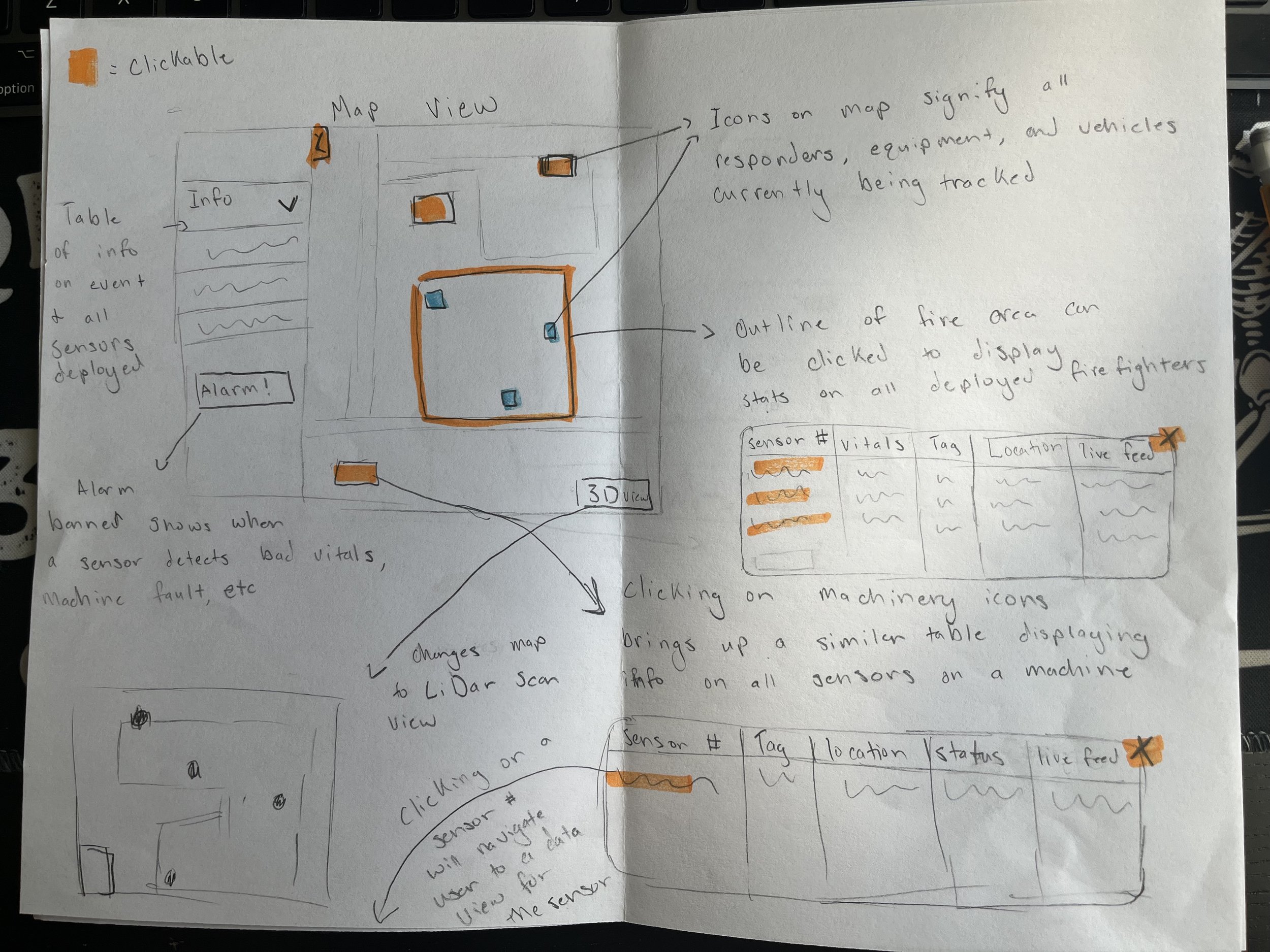
I began the prototyping process by creating a few sketches that fleshed out some initial high level ideas, and put together a few user journeys to map out the flow of the dashboard. I wanted to limit the amount of different screens users would need to interact with to less than 4. Additionally, I limited all essential interactions to swipe and tap gestures, and anything requiring typing needed to have nothing to do with active emergency functionalities.
Since most of our users would be using this technology as a way to view their location in relation to the main area of an emergency and other resources, I decided that the fist screen they look at should be a map view. Right away, they can see where the active emergency is based on how areas of the map are colored, and they can see locations of other resources based on various icons. By clicking on any of those icons, they are provided with a table that clearly indicates status and provides exact location data.
Users like active responders in the field that only care about high level details pertaining to their own selves have the option to quickly scan information, but users that may be stationed at incident command that have more time and less urgency can drill down into more specific details.


DESIGN PHASE
The below design reflects a need for a simple and easy to use app that even an impatient first responder can handle. All interactions require but a simple tap or swipe. Users can quickly check in on resources through the map screen and an easy to scan table view. They can access detailed screens dedicated to every asset deployed, view their most important vitals, and look at what they are seeing via camera stream. Additionally, users can update their own profiles, and can look into their location history if needed. Most importantly, users have the options to send warning alerts to other responders that may be in danger and can always report if they are experiencing an escalating crisis themselves.


Unfortunately, I left WinterWinds before I could fully finish this project. However, I was able to put the design in front of a few potential users. These users liked the quick navigation and detailed information on resource status. Their critique was that they wanted more features focused on communication between responders, teams, and command stations. They also questioned how usable the design would be in an actual emergency environment where condensation, gloves, and heat could affect screen interactions.
If I remained at WinterWinds, my next steps would have been to:
Identify communication features that could be implemented and research how the application might integrate with common communication devices used during wildfires like radios, towers, and text messaging.
Start setting up a robust usability testing protocol and process that put the application to the test to ensure that it would be usable in the environments it was intended for.
Other Contributions
In addition to designing and iterating on an application design, I also assisted in making sure that the entire process of creating and delivering our physical product was as seamless and user friendly as possible. In order to truly understand our product, I learned about wiring and electrical assembly, vehicle installation, federal product requirements, and more. With this new knowledge, I was able to help our engineers pick an electronic component layout that would be easy to access and repair in the future, assist in picking a visual look and color scheme for the product, and I was able to help determine the best way for our product to be installed. Additionally, it was my responsibility to decide on how we went about teaching users to interact with our physical product and the previously mentioned application interface that came with it.